Making Your Menu Standout
by Hani Jouni, Appetite Graphics
Restaurant Menu Guide

You have good food, a unique restaurant and you want to put together a real nice menu.
You’re ready to make your menu stand out, but here come the challenges. You do not want your menu to look like the rest, so don’t fall into common traps. Your restaurant menu is your first interaction with your customers. Make it a good experience; not too wordy. You will notice that the nicer the restaurant, the less wordy the menu is and it has fewer descriptions.
Your menu communicates without a SERVER and often illustrates without a PICTURE.
Font Selections
Choosing the right font is the most essential feature of your menu. You may want to use a font that works around your logo or a restaurant theme that you have established, but it may not be appropriate or easy-to-read. You want to pick a font that is basic but gives the impression of being unique. Don’t make it hard for your customers to read the menu. You want them to feel at ease and at times you may have to give up the style of the font in order to make it useful. Your font needs to be appropriate. Do not mix typefaces. If you must, do not exceed two type fonts and sizes should be limited to: 1-Category, 2-Items and Prices and 3-Description, if even necessary. The same font family should be used; light, medium and bold. Know your font styles such as serif, san serif or script.
Size of Menu
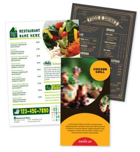
 Decide on the size of the menu you want to print. Many restaurant owners make this decision based on common sizes such as 8.5 x 11 or 8.5 x 14. Your menu does not need to look like the others, unless you decide to place your menu inside clear cafe menu covers (which are limited in sizes). The question you need to ask yourself is “why limit myself”, especially since you are making the menu for your dining room and the number of table or the seating available. The cost of customizing your menu to your liking and making it a unique size is very minimal with regard to the printing cost. Many restaurant managers think that the cost of printing a unique size menu may be too high; however, they often realize that the cost of printing 50 to 100 menus (which is determined by the number of tables in the dining room) is minimal compared to the cost to print them in a unique size. Do not limit yourself. You are spending less on printing your menu and far more on your time to design the menu, whether you’re making a NEW menu or making CHANGES to your current menu. Decide on the size of the menu you want to print. Many restaurant owners make this decision based on common sizes such as 8.5 x 11 or 8.5 x 14. Your menu does not need to look like the others, unless you decide to place your menu inside clear cafe menu covers (which are limited in sizes). The question you need to ask yourself is “why limit myself”, especially since you are making the menu for your dining room and the number of table or the seating available. The cost of customizing your menu to your liking and making it a unique size is very minimal with regard to the printing cost. Many restaurant managers think that the cost of printing a unique size menu may be too high; however, they often realize that the cost of printing 50 to 100 menus (which is determined by the number of tables in the dining room) is minimal compared to the cost to print them in a unique size. Do not limit yourself. You are spending less on printing your menu and far more on your time to design the menu, whether you’re making a NEW menu or making CHANGES to your current menu.

Color and Background
Just as picking the right font is essential to any menu, choosing the right color is just as important. You and you alone know the lighting in your restaurant and that should be the basis for your Font color or Menu Background color. You do not want a dark colored background or a light font if your dining room is not well lit or has a dinner atmosphere. Having a nice graphic or an abstract art background may be a nice touch, but it will be too hard to read and become distracting for your customers. You want your customers to be at ease, feeling good and having an experience worth repeating.
Do You Really Need Images?
 If you have been dining out you will notice that there are few types of menus. If you have been dining out you will notice that there are few types of menus.
The first type is that big image, casual, café style menu in such restaurants as Applebee’s, Chili’s and Denny’s that feature large size images with some pages having no descriptions whatsoever.
Another type is that small independent restaurant style that often uses the 8.5 x 11 menu size with many images with much description. You also tend to see more items on these menus.
The other type is the high-end diner or steakhouse restaurant. Those tend to have one color, a basic font and leave out the descriptions altogether. You often find those in high priced restaurants. I believe that it is intentional because they want you to interact with the server, making the customer the most important person at that moment.
Many restaurants struggle with choosing the right photo or image. There is no substitute for having professional photos taken of your food but some restaurants have limited time and resources. Choosing a stock photo may be a good option. Do not limit yourself by using a photo that has a different bun or cheese or lettuce. You can use vegetables and ingredients to make your food look fresh.
Whether your restaurant is for breakfast, lunch or dinner, choosing the right font, color, size and image is essential.

I look forward for your feedback.
Write back to hani@mrgrphx.com
Hani Jouni
Appetite Graphics
|